
Bruno Díaz


We have inherited from analog books the aesthetics of complete justification, found in most books on our shelf. The absolute order, elegance and peace it conveys takes us to a much more harmonious and controlled place but the truth is that this feature was left behind at the time when our environment was digitized and we began to create online content. A new support gives way to new ways of designing and understanding the space, as well as the adaptation of the typographical composition to this medium.
A new era of pixel communication ceases to be so controlled, we no longer measure millimeters nor can we control the position of each letter, the responsive world creates a new way of understanding space in the design of our website.
The main difference between designing a book or designing a website is that we stop controlling each parameter and come to understand that, when we apply a complete justification in web design will automatically calculate the space of each line and, depending on the width of the column, the words will be distributed in the best possible way to fill that line thus creating large white rivers* as we see in the following example.

*We call white rivers the spaces that are generated in a paragraph between the words. Something very unsightly that in a web page can change depending on the width of the column.
Full justification on the web is not only an obsolete and not very aesthetic resource, it is also not very functional as it prevents the user from being able to make a smooth and pleasant reading of it. It is true that nowadays there are native technical solutions for browsers such as hyphens, but their precision is far from that of text editing programmes for printing, where each block of text can be adjusted individually according to its position on the page.
This desire for control comes from the need of many people to see the right side of the columns perfectly aligned, something that, once overcome (see the column of this post), is nothing more than a feature of a paragraph ready to be read and understood. I am sure that while reading this text you have not had any problems, you have been able to read quickly without getting lost and without noticing the composition. As it has been said many times in the design world: "Good design is invisible".
There is a CSS property called "hyphens" that can generate justified text that behaves well on the web. This property controls word splitting in a text when it fits a container. You can take the values "auto", "none" or "manual". "Auto" allows word division according to language separation rules. "None" avoids word division at all. "Manual" allows word division only at points where the "-" script is added. But be careful: this property has restrictions: its support varies according to the browser and the language used. In addition, there may be differences in how the word separation rules apply based on language and user settings.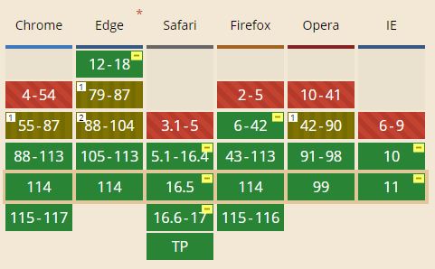
The "hyphens" property in CSS supports some but not all languages. In our case, we do not use it often, because although it can work in Spanish and English, it does not in French or Catalan, languages quite common in our web projects. You can check all the compatibility in this caniuse list.
We think it’s best to enthusiastically embrace the left (or right) justification of texts, but avoid using full justification in web design. Your website will be readable and will look much more modern and current. However, if you still insist on justifying, explore applications like the one described a little above, although today there is no solution that behaves well and does so in most browsers and languages.
Hello! drop us a line


Full justification on the web is not only an obsolete and unaesthetic resource, it is also not very functional as it prevents the user from being able to read it fluently and enjoyably.