
Francesc Sánchez


Web usability is a series of principles that, guided by common sense, aim to make digital users’ lives easier: everything accessible, transparent and clear at all times for the user. In this post we will review its principles, along with plenty of examples and implementation tips. Let’s go:
We could define web usability as “the ease of use of user interfaces”, according to Nielsen & Norman, leading experts in the field.
Web usability is one of the factors that make up the user experience (UX), along with others such as accessibility, security, or loading speed, among others. Although it is often confused with user experience, the latter is much broader. UX as a whole is a feeling, a satisfaction (or not), while usability is mechanical and measurable. We can execute a usable action that does not necessarily generate satisfaction.
In the industry, the 10 usability heuristics of Nielsen & Norman are still used as a benchmark, and we will review them below:
Users need to know whether their interaction with the website has been successful (or if it has failed). The most common case is submitting a form. I must clearly see on screen whether the form was sent correctly or not. Using clear status colors is recommended — green for success and red for failure. You can complement this with a confirmation email. The goal is to reduce uncertainty as much as possible. For long processes that require uploading many files or connecting with external services, we must be transparent and inform the user that the task is in progress and will finish soon. In e-commerce, a very important aspect is to notify the user clearly and intuitively when an item has been added to the cart.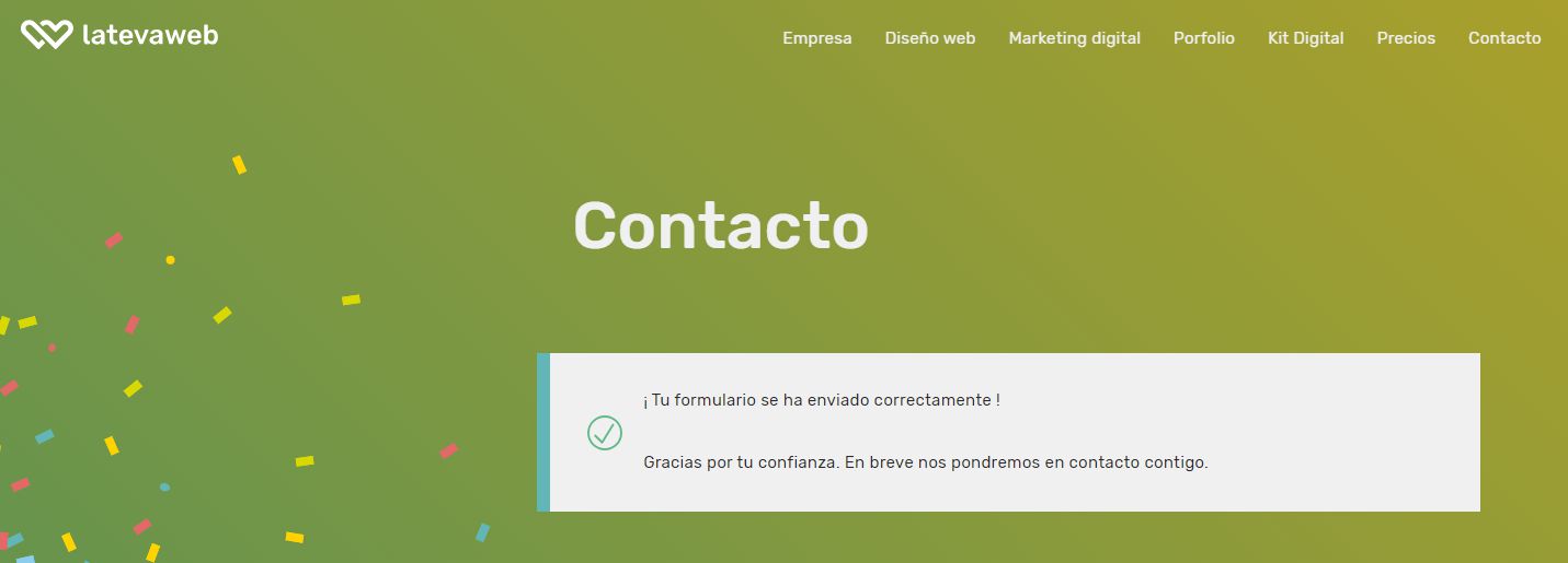
This point refers to the system using the language and codes that the end user will recognise — both textual and visual. Classic examples include: icon systems to identify categories or services, or size guides in online fashion shops. When asking for a credit card code, showing a picture to help the user locate it is useful. Show examples, real photos of real people like your users, so they can translate your digital proposal into their physical-world context. In online stores, you’ll see more and more product photos with models resembling the buyer persona, so users can imagine what the product will look like on them and understand its size.
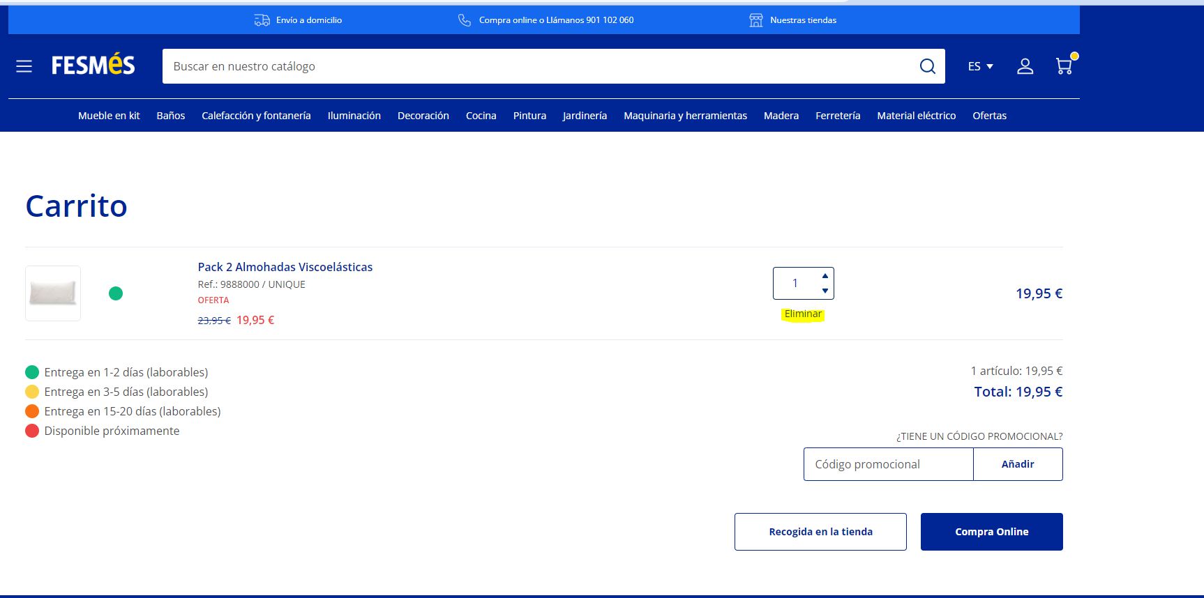
This point is crucial and often overlooked. The user must have control and be able to interact with the website freely, being able to carry out processes but also undo them if needed or desired. Even if it benefits the marketing department, we cannot trap the user intentionally. We must always allow them to navigate back or leave whenever they want. In online stores, a still-common bad practice is preventing users from removing items directly from the cart, forcing them to return to the product page — that is at least a 0 in web usability. Other recommendations include implementing breadcrumbs, back buttons, or a current indicator in the menu to highlight the active page.
All digital interfaces should follow well-established conventions that users have internalised through their browsing habits. It is valid to be creative, but if 99% of websites place the menu in a certain place and the cart icon looks a certain way, innovating here is a huge risk. Users expect to find features in familiar places. In an online shop, they expect: a magnifying glass for search, a user icon for login, a heart for wishlist and a trolley icon for the cart. Innovating here is reckless.
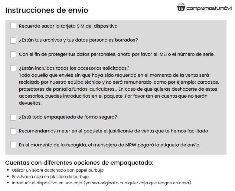
We mentioned in point 1 that users must be notified of system status, including errors. But the key is to anticipate and prevent errors. Particularly in complex procedures, having clear instructions available helps reduce mistakes and customer service inquiries:
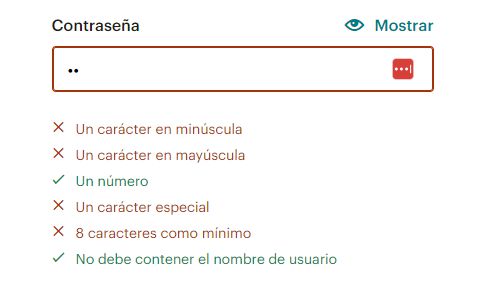
A particularly painful scenario is setting a password. If the system requires a secure password with specific conditions, instead of waiting for the user to get it wrong, we can warn them beforehand by showing the requirements they still need to meet:
Or in an e-commerce product page with attributes: if a size or colour is not in stock, do not allow adding it to the basket. Another good example is handling misspellings in search bars using synonyms or suggestions to avoid “0 results”.
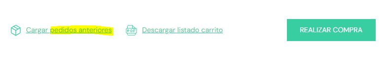
Users should not have to remember information from one part of the site to another. Let’s make it easy by saving their data and keeping it visible. Examples:
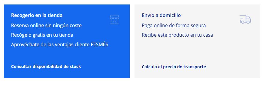
Content personalization is a growing trend in digital marketing, but it has long been a usability principle. A website must adapt to all kinds of users with different needs and preferences. A clear example in e-commerce is offering multiple payment and shipping methods: this minimises abandoned carts by letting each user choose what best fits their habits and context. An online shop with only one payment method loses many sales. Likewise for shipping: offering express delivery, multiple couriers, pickup points or in-store pickup increases conversion.
In web design we always say that less is more, and it’s not only an aesthetic principle — it greatly impacts usability. It’s no coincidence that most e-commerce sites now use white backgrounds, very legible fonts and clean, breathable layouts. Avoid cluttered websites full of competing colours, elements and fonts. When in doubt, always check Apple’s website: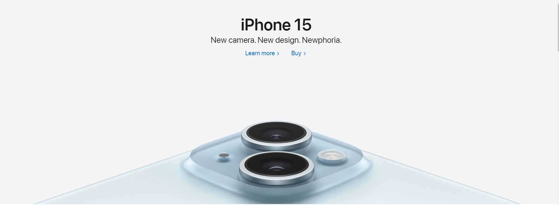
Error messages must be understandable for regular users, not only machines. Beyond the error message, we can offer constructive suggestions: try again later, call customer support, or show alternative products. Pay special attention to error messages in forms, checkout processes and the 404 page.
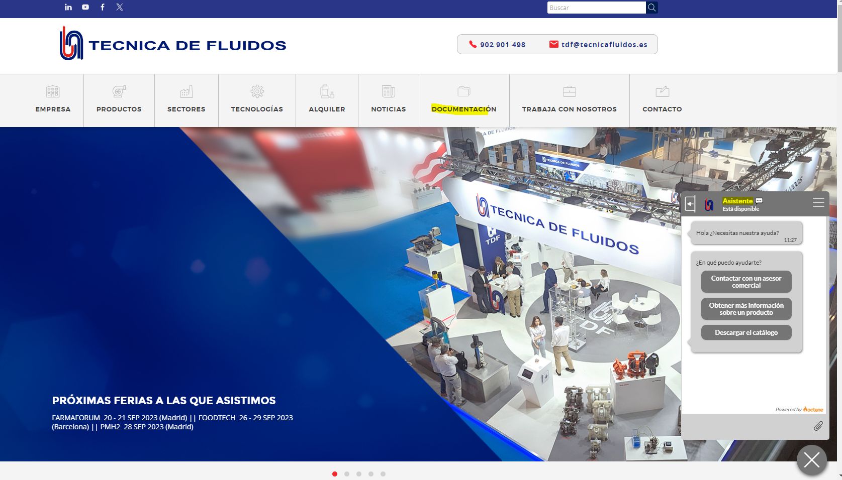
The ideal scenario is that the website is so clear that these features are rarely needed — but it’s always good to have them available. This can be solved with a documentation section, FAQs, help and contact options, or even a chatbot (a helpful one, not a frustrating one).
You should engrave these web usability principles in your mind, as they are key to user experience and have a huge impact not only on SEO, but especially because failing to follow them means losing countless business opportunities, which is ultimately the goal of 99% of websites.

Hello! drop us a line

Web usability: what it is and how to improve it